Branding
One critique i have for most designers / dental related ventures is that all the branding tends to revolve around a single dental piece such as a molar, a molar with a heart and or a family, so this time my client ad me worked towards building a brand where we focused more on the smile part of the face

Main Idea
I started the groundwork by looking at how faces are made in computer generated images as well as in illustrations, I also used the help of basic symmetric shapes, and that’s where we got the main shape of the logo

Main Idea

I started the groundwork by looking at how faces are made in computer generated images as well as in illustrations, I also used the help of basic symmetric shapes, and that’s where we got the main shape of the logo


Logotype Versions
I try to design my logos to fit in most shapes and spaces available that’s why in this case we made 1:1 version, a horizontal versions well as the Negative one used for dark colored backgrounds
Logotype Versions


I try to design my logos to fit in most shapes and spaces available that’s why in this case we made 1:1 version, a horizontal versions well as the Negative one used for dark colored backgrounds

Website
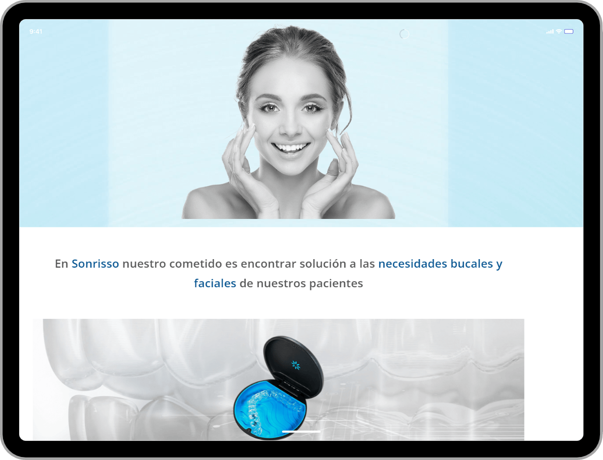
Using the designed guidelines in terms of colors, shapes, content and direction we are currently designing the website for Sonrisso
Website


Using the designed guidelines in terms of colors, shapes, content and direction we are currently designing the website for Sonrisso
Stationary
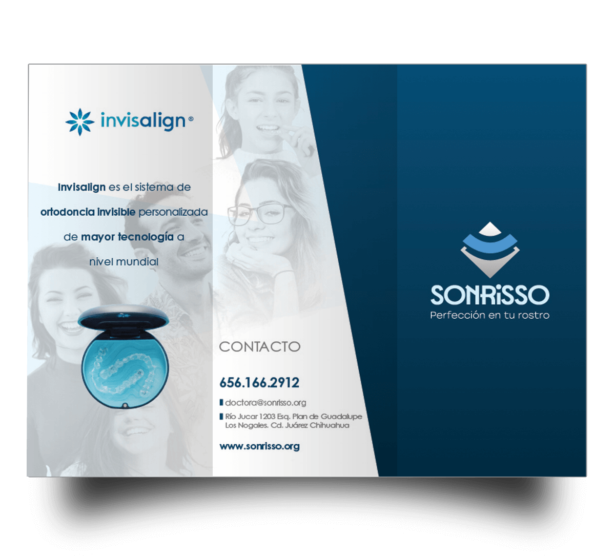
I designed the stationary of sonrisso, in this case is a trifold, where we offer Invisalign, and show all its bennefits

Stationary


I designed the stationary of sonrisso, in this case is a trifold, where we offer Invisalign, and show all its bennefits

